Nue Design Systems
Lead Product Designer & Manager
Advicefront offers a platform for financial advisors that simplifies client management, financial planning, and compliance automation, integrating tools like data collection, risk profiling, reporting, and electronic signatures
My Role
My role was to manage the design systems, scale the platform, and speed up development with the goal of an IPO within three years. Although the company already had three major clients, as a SaaS business, it needed to attract more. They recognized the need for a modern approach, different from their existing setup. This involved enhancing the user interface, art direction, and design to create a more contemporary and spacious look, ultimately instilling greater confidence in the end user.
Advicefront was improving advising times and helping
to accelerate processes, but they needed more.
Goal
Firstly, creating reusable components accelerates the development process and enables quicker delivery. Secondly, ensuring consistency is vital; rapidly growing teams require design standards to maintain a cohesive user interface. Lastly, kickstarting DesignOps by centralizing design guidelines in one repository streamlines the workflow and promotes efficiency.
Team
In this project, I worked with two designers, one of whom was a beginner learning to create components from scratch. The development team had three front-end developers. As the manager and sponsor, I was responsible for overseeing the whole project, setting priorities, and keeping all stakeholders informed, empower the team and evangelize the company about the design systems. I also made sure everyone understood the project's goals and benefits, using UX design principles to keep everything on track and ensure everyone was on board.
Plan
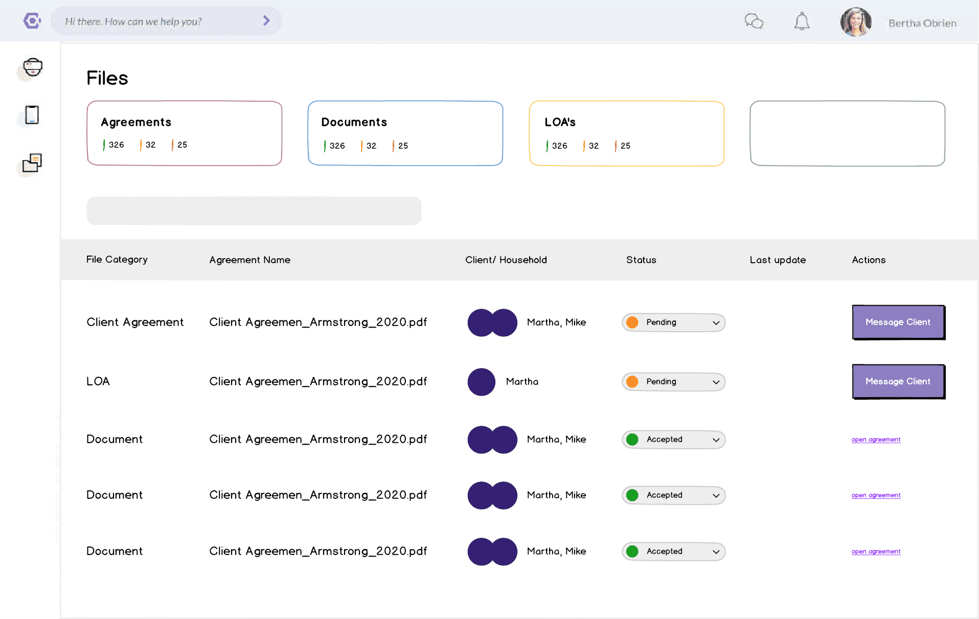
The initial steps needed to validate the project’s value. I opted to develop the components from scratch because the existing ones were significantly outdated; starting anew was the most efficient approach. In the first three months, I established the entire foundation and built the key components. Additionally, I spearheaded an initiative to showcase our ability to revamp the current interface using the new design system, incorporating a modern aesthetic and providing a comprehensive project overview.
1
Foundations & Components
Typography / Button / Input
2
Patterns
Navigation / Payment Card Input
3
Layouts
Login page / User settings page
4
Documentation
Login page / User settings page
Foundations and Components
Foundations
Accessibility (beta)
Icons (beta)
Typography (beta)
Spacing (beta)
Colours (beta)
Elevation (beta)
Radius (beta)
Breakpoints (Grids)
Line (Divide and Scroll)
Brand
Patterns
Global Navigations (beta)
Layouts
Error Pages (404, 402, 500)
Error Pages
Components
Action List (beta)
Alert (beta)
Avatars (beta)
Badge (beta)
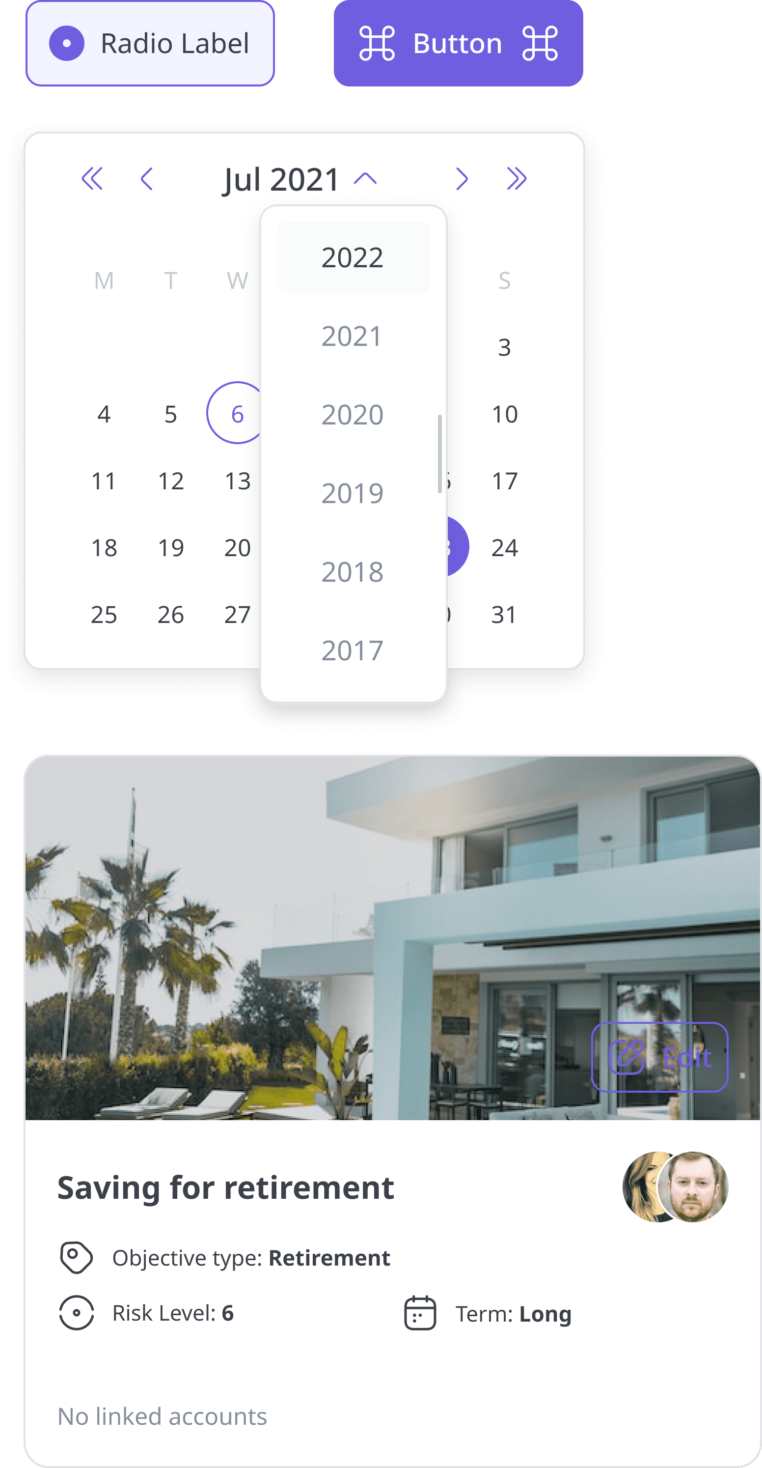
Button (beta)
Cards (beta)
Carousel (beta)
Checkbox (beta)
Chips (beta)
Date Picker
Dialog (beta)
Drawer (beta)
Dropdown (beta)
Empty State
Loading Button
Modal (beta)
Pagination (beta)
Payment card
Popover (beta)
Radio button (beta)
Select (beta)
Skeletons
Snackbar (beta)
Spinner
Status
Tabs (beta)
Table (beta)
Text field (beta)
Text area (beta)
Toggles (beta)
Tooltip
Search field (beta)
Wizard
Components Architecture
States
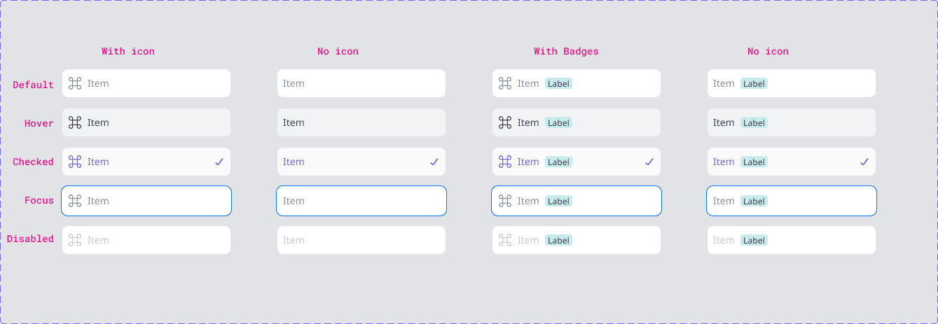
Can have variations such as Default, Focus, Hover, Pressed, Selected, and Unselected.
Skin
Can be Primary, Secondary, Tertiary, and Quaternary.
Type
Can be Info, Success, Warming and Error.
Size
Can be Small (S), Medium (M) and Large (L).
Component Page Documentation
$Spacing
Baseline Spacing: 8px
Token
Name
Rem
Px
$spacing-0
none
0
0
$spacing-01
XXS
0.125
2
$spacing-02
XS
0.25
4
$spacing-03
S
0.375
6
$spacing-04
sm
0.5
8
$spacing-05
ml
0.75
12
$spacing-06
l
1
16
$spacing-07
xl
1.5
24
$spacing-08
2xl
2
32
$spacing-09
3xl
3
48
$spacing-10
4xl
5
64
$spacing-11
5xl
6
80
$spacing-12
6xl
7
96
$spacing-13
7xl
8
112
$spacing-14
8xl
8
128
$Stack
Stacking refers to the vertical arrangement of element
$spacing-05
Lorem Ipsum is simply dummy text of the printing and typesetting industry. Lorem Ipsum has been the industry's standard dummy text ever since the 1500s
$Gutter
Gutter is the space between two columns
The quick brown fox jumps over the lazy dog
Lorem Ipsum is simply dummy text of the printing and typesetting industry. Lorem Ipsum has been the industry's standard dummy text ever since the 1500s
$spacing-03
Outcomes
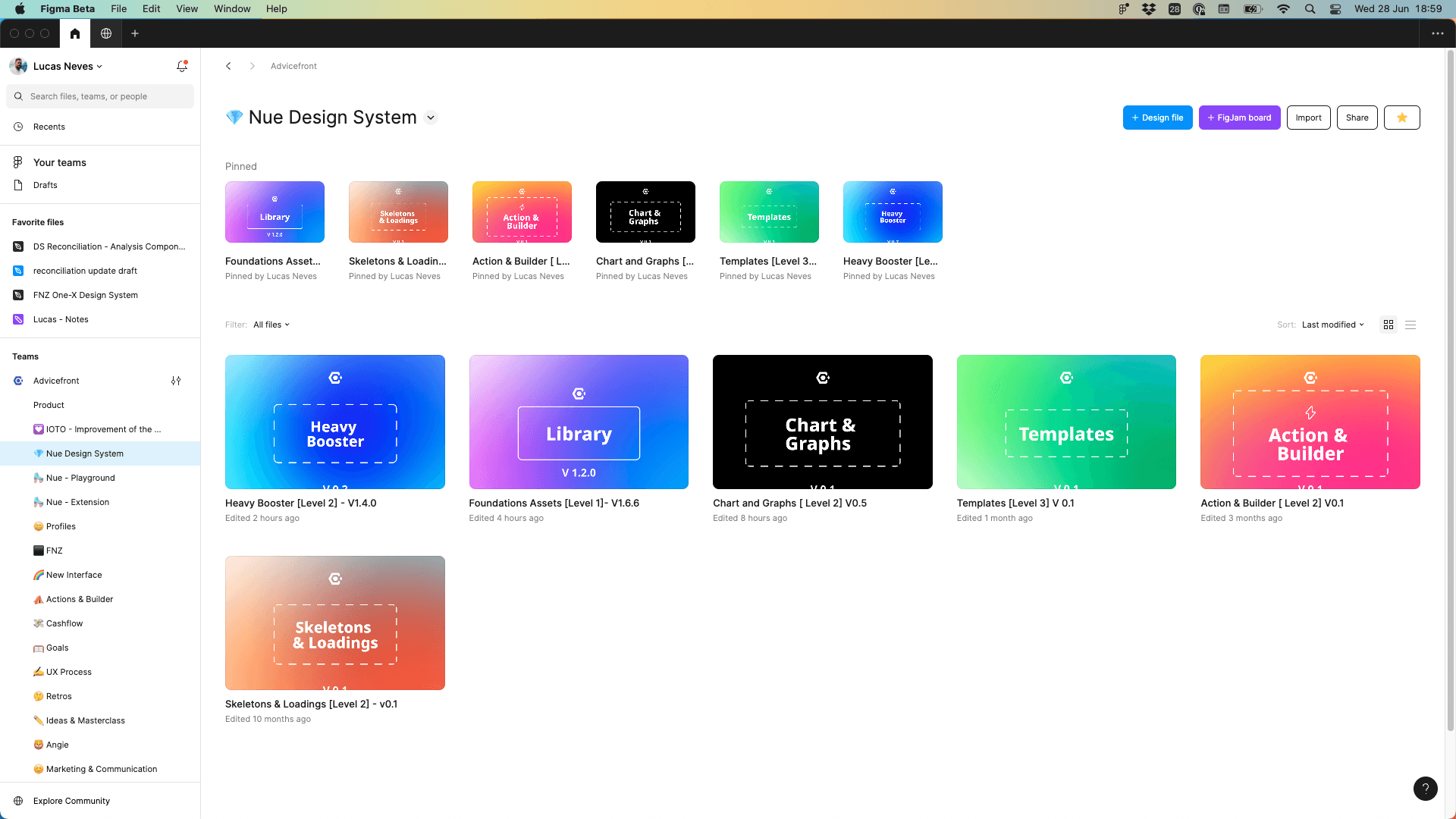
1 - Foundations, The main library responsible for the components.
2 - Heavy Booster (Patterns), is the library that offers a wide range of components or groups of components, making it easy to use common elements like sections, sidebars, drawers, and navigations without having to recreate them.
3 - Chart & Graphs, despite being in the initial stages, we have started to include some graphs and are working on making them part of the standard patterns for all devices.
4 - Builder, is the library for document builder patterns.
5 - Skeletons & Loadings, s a library designed to provide patterns for empty screens and loading screens. Particularly for complex information where loading can be slow and might affect the screen layout, this library is created specifically to address that.
6 - Templates, are large pages, like login pages, so they don't need to be created repeatedly. They also include features that need to interact with other features, ensuring everything is cataloged in this library as well.
Figma Libraries
Foundations File (Level 1)
It serves as the primary library! It houses all variables, variations, components, and brand elements. With each new version, the file is published and the documentation is updated. If the changes are significant, all developers and designers are promptly notified through a dedicated Teams channel.
Heavy booster (Pattern library - Level 2)
It serves as the primary library! It houses all variables, variations, components, and brand elements. With each new version, the file is published and the documentation is updated. If the changes are significant, all developers and designers are promptly notified through a dedicated Teams channel.
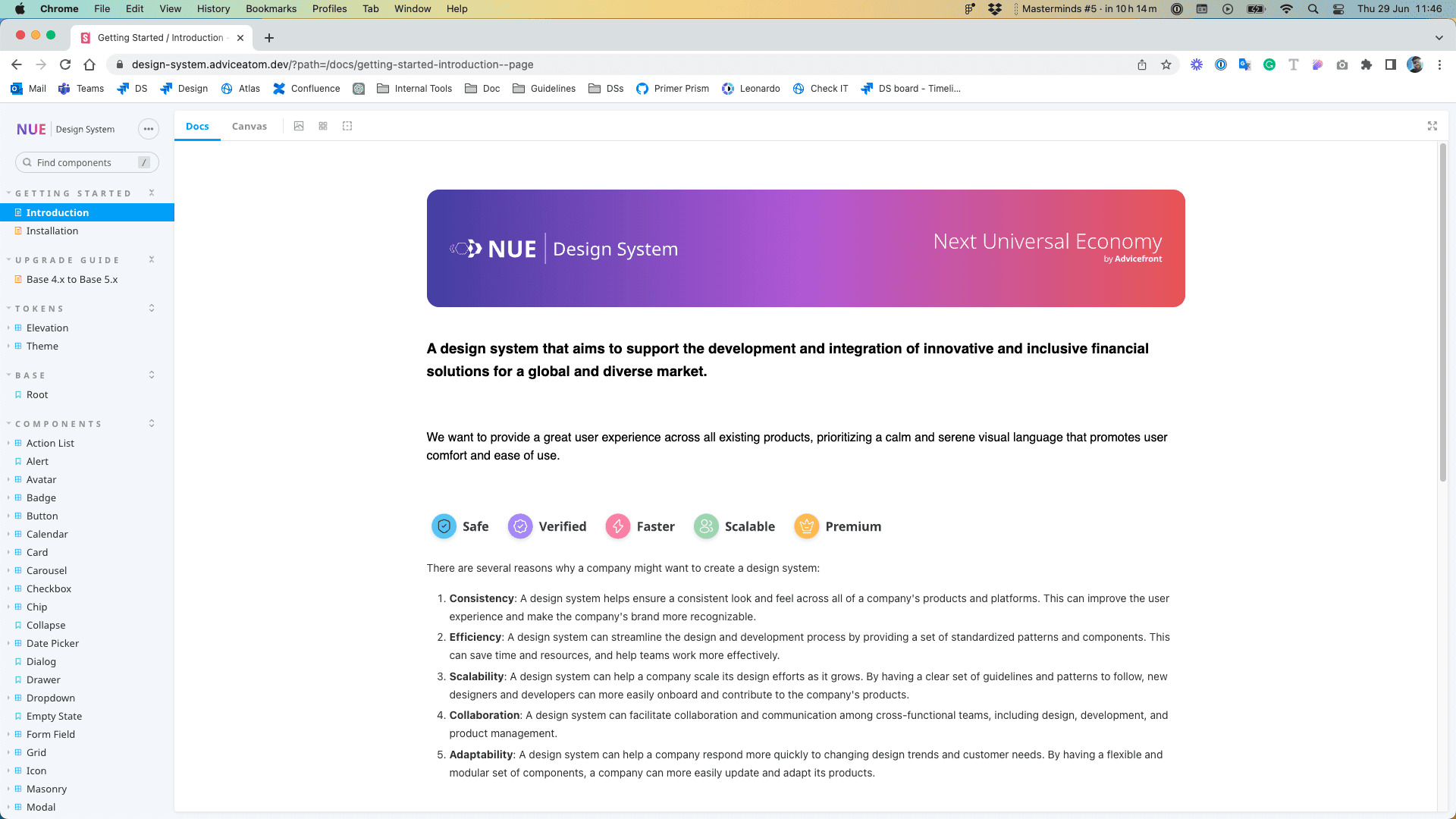
Storybook
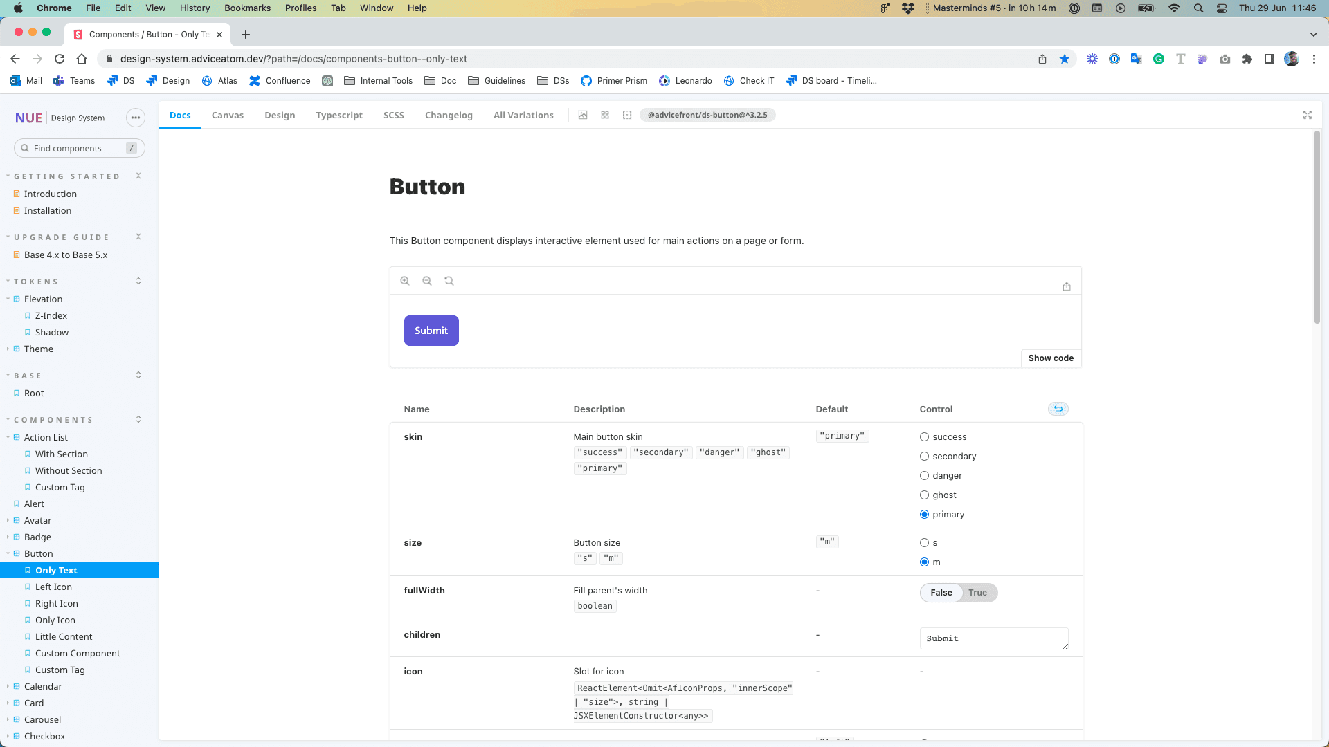
The link to the storybook is private, but essentially, it encompassed all the components and patterns used in the front-end code. This resource was invaluable for our UX design process, providing a comprehensive reference for designers and developers alike. By leveraging the storybook, we ensured consistency across our user interfaces, facilitated collaboration between team members, and streamlined the design-to-development workflow. The storybook served as a single source of truth for the visual and interactive elements of our application, making it easier to maintain design coherence and improve the overall user experience.
the button with all the predefined properties. The front-end team simply needs to call the button in the code, and it will automatically display with all the specifications we've set. This streamlines their workflow, allowing them to focus on other important tasks without worrying about additional property definitions
Results
4
Revenue increase
